AQA GCSE Risk Factors & Data Analysis (Biology)
Risk Factors & Data Analysis
A risk factor will increase the chance that a person will suffer from a particular disease.
Sampling and Risk factors
Sampling is when you look at a smaller group of people (a sample) instead of the whole population to find out about a risk factor or disease.
You need to understand why sampling is used and how it can give reliable results about risk factors.
Why use sampling?
It’s usually impossible or too expensive to collect data from everyone.
A well-chosen sample can give a good estimate of the population.
How it applies to risk factors:
Example: You want to know if smoking increases heart disease.
Instead of testing everyone in the UK, you take a sample of people.
You check how many in that sample smoke and how many have heart disease.
This helps scientists estimate the risk in the whole population.
Principles to understand:
Random sampling: Every individual has an equal chance of being chosen → reduces bias
Sample size: Larger samples usually give more reliable results
Representative sample: The sample should reflect the population (age, gender, lifestyle)
Translate information between graphical and numerical forms
You should be able to take data in a table (numbers) and draw a graph (bar chart, line graph, etc.).
Or, you should be able to look at a graph and write the numbers in a table.
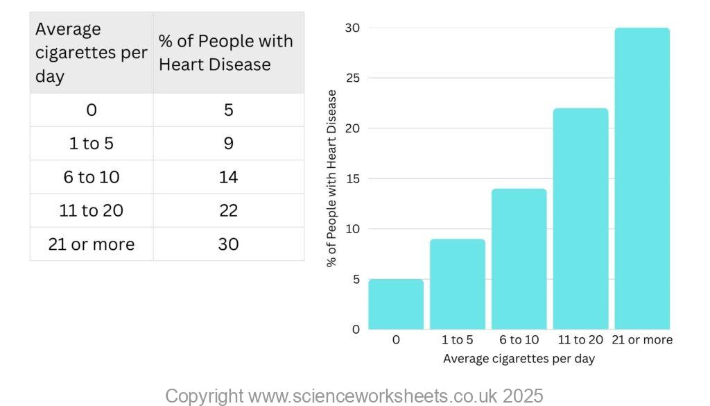
Example: A table shows smoking rates and heart disease cases. You might need to plot a bar chart showing the relationship.
Extract and interpret information from charts, graphs, and tables
Extract: Pull out specific numbers or trends from a graph or table.
Example: “What percentage of smokers developed heart disease, if they smoked on average 7 cigarettes per day?”
Answer 14% (using data in bar chart above)
Interpret: Explain what the data shows about risk factors.
Example: “The bar chart shows that people who smoke more cigarettes per day have a higher risk of heart disease, suggesting smoking is a risk factor for heart disease.”
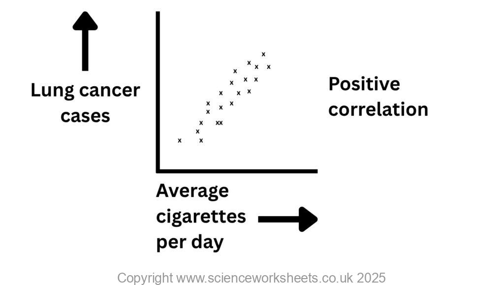
Using scatter diagrams to identify a correlation between two variables in terms of risk factors.
This means you need to understand how to use a scatter graph to spot a correlation (a relationship) between a risk factor and a disease in GCSE Biology.
You should be able to:
Look at a scatter diagram (dots on a graph)
See if there is a pattern between two variables
e.g. smoking vs lung cancer cases
Decide if there is a correlation (link)
| Type of correlation | What it means | Example (risk factor → disease) |
|---|---|---|
| Positive correlation | Both numbers go up together | More cigarettes → more lung cancer cases |
| Negative correlation | One goes up, the other goes down | More exercise → less heart disease |
| No correlation | No clear pattern | Shoe size vs risk of diabetes |


Practice Questions
1.State what a risk factor is
2. When sampling, what factors should we consider?
3. Explain what is meant by a positive correlation
Factors affecting the rate of photosynthesis
Measuring & calculating rates of photosynthesis
Inverse square law and photosynthesis
Economics of enhancing the conditions in greenhouses
Investigating the effect of light intensity on the rate of photosynthesis
Data analysis and nervous system
The effect of a factor on human reaction time
Controlling blood glucose concentration
Regulating water and nitrogen levels in the body.
Hormones and human reproduction
Using hormones to treat infertility
Control and coordination in plants using hormones
Investigating the effect of light or gravity on the growth of newly germinated seedlings